
Tuesday, 2 March 2010
Arrrrgh!
Having a bit of a panic for no reason. Feeling a bit like I'm not good enough to master the skills of Photoshop and digital illustration. Not good.
Basic Photoshop - Pen tool tutorial
http://www.melissaclifton.com/tutorial-pentool.html
Tutorial to kickstart my research into using the Pen tool more effectively.
Also looked at: (bit more in depth)
Monday, 22 February 2010
Essay and Professional Project
My essay research is underway though I am struggling to find myself the appropriate images and title. I want to focus my essay around my Professional project and look at editorial illustration, perhaps looking at how it's changed from as far as back as the Gutenberg press. I'm unsure whether this will give me enough to write about so I will run it past my tutor today.
Last Friday we handed in the Learning Agreement and over the weekend I've bought myself a couple of books based upon contemporary illustration which should provide me with inspiration and initiate the ideas process for the project. I need to ensure that I structure my time well and research thoroughly so that I produce the best possible outcome. I've found that I already have an idea of how I want it the work to look which I need to leave and develop ideas based from the research.
Wednesday, 17 February 2010
Steinberg lecture
Today we had a lecture with Anna Steinberg who is a freelance illustrator. She gave a presentation and provided advice on how to get yourself set up as a freelance illustrator which was really helpful and refreshing. I had the chance to have a quick chat with her and showed her my portfolio. She identified that my work needs to have more cohesion as the work doesn't seem to have a consistent style which I agree with to an extent. From my point of view I am still exploring different ways I communicate through my illustration. I'm unsure that I have established my own style, I think it's something that will come naturally over time.
At this moment in time I'm trying to decide whether to move onto Illustration for my 3rd year or to continue with Visual Communication. My worry is that my illustration hasn't developed enough over the last couple of years to get me onto the illustration course. I need to have a chat with my tutors and a chat with a tutor over on the illustration course to give me some direction. If I were to continue on my current course I feel I could still carry on with the work and run my own self initiated illustration alongside which I have been currently doing.
To help me make my decision I definitely need to sit down and have a chat with tutors, peers and family. Take all of that advice on board and ultimately make my decision.
Where do I see myself in the future? Where does my passion lie?
Friday, 12 February 2010
Animal Farm Event

 The Animal Farm fund raiser went really well and apparently the Panda screen prints I did sold really well! Which I can't quite believe but it was a great night and very rewarding seeing my work sell.
Wednesday, 10 February 2010
Professional Project thinking
Tomorrow I have to present my initial ideas for my professional project. Right now I think I have got an idea in a mine field of other thoughts. I'm struggling to produce one solid idea to present for tomorrow so I think I am going to have pull together my ideas and run through a couple and hopefully I can gain feedback that provides me with one solid idea so I can give myself some direction. I'm feeling confident that I will present well and this will build upon my confidence to present on front of several people.
Monday, 8 February 2010
Fund Raiser and ycn meeting
Me and Ben met up today to progress with the competition brief and then prepare work for the fund raiser on Wednesday at Sixty Million Postcards. Out of the screen prints I produced 5 were good enough for sale and another 4 will be sold in a separate bargain bucket as they didn't turn out as well as the others.
Thursday, 4 February 2010
Professional Project launch
So the professional project has launched, the day that seemed so far away when I arrived back at uni in October and somehow it's here. This morning I felt confident of my idea and the direction I was heading but now it seems that what I thought was going to work probably wouldn't after a good discussion with peers on the course.
I find myself lost on day one which is a very strange feeling, as this usually happens at least a week in! Though I think it's good that I've woken up and realised this is my opportunity to create the best piece(s) of my career so far. It's highly unlikely that I will have a chance as good as this to design whatever I want. I know that I want to produce a more illustrative based outcome, however I don't want to shut off other possibilities with this golden opportunity. My initial idea was to create a brief where I designed a Graphic novel, which I would create and develop characters, storyline, setting, layout, typography and overall design. I saw myself designing the whole thing, but I had sat back and asked myself; What do I see myself doing in ten years? Even five years!? Where would I want to be in the future? These questions I can't seem to answer, but I think I can answer them with the Professional project. Maybe that's what my project should be about, my journey to find the answers, my dreams and ambition.
Who knows... All I know is that I am going to push myself as far as I can because I don't want to look back and have regrets.
Wednesday, 3 February 2010

Tuesday, 2 February 2010
Bleeding Heart Boy
Spent the last hour or so working on the Storyboard brief. I'm currently drawing up a human heart from different angles, I'm not entirely sure how the drawings will be used but I've designed a fairly detailed heart from 4 angles which I will watercolour with a deep red. I will upload the first set of storyboards over the next few days then look to the second script.
I've found it difficult liaising with a client who is based in a different part of the country as it is so much easier to understand the brief and what the client wants in a meeting. It's certainly been more challenging working on this brief as it's difficult to understand what exactly the client wants. Without being face to face you can't gain the level of feedback needed on the work you send over so I have to improvise with what I understand and my interpretation. I've also found it difficult to retain contact with the client due to being busy, so I've learnt that I need to chase up clients a lot to ensure I can continue to work on the brief. I think in the future I must chase the client up on a more regular basis and make sure I ask for a telephone number if they are in a part of the country that isn't easy to reach in such a short time frame. By taking on this Live brief I've developed a better understanding of how to approach a client in a professional and friendly manner. When chasing up a client I have found that you have to be wise to how you word your message to ensure you are friendly but assertive.
Competition brief meeting
Yesterday myself, Ben and Luke arranged to meet up to launch our competition brief properly. We began to research into famous British musicians from past decades. The album covers all had similar elements running through their designs. We gathered as much imagery as possible and made note of what we thought worked.
Our task is to create a campaign concept for the Great British Music Experience so we've decided that we're going to design a series of 4 posters, each from a different decade. We're starting from the 60s and ending with a poster for the 90s as we feel this is manageable and we can execute our idea well. After a couple of hours I think we all had several ideas that we could run with, so it was agreed that we would all attempt designing roughs of potential layouts and styles. I aim to put together 3 or 4 different designs and then arrange to meet up with everyone again so we can have a look at our designs and have a small critique betweens us. Hopefully we can combine all of our styles to form an overall look and provide continuity throughout the series of posters.
Thursday, 28 January 2010
PPRD Tutorial
Had a tutorial this morning to help with the development of my blog, competition and live brief. I now have a better understanding on where I need to improve my work and have a better sense of direction. I've learnt that I need to be more reflective with my blog posts and explain what I've learnt from the sessions.
Myself and Ben are going to the library to pick up a couple of books on the History of British musics so we can kick start the YCN brief. We're thinking of researching into the origins of British musicians and somehow working this into are work.
PPRD - Storyboards
I took on a Live brief a few weeks ago which I have been asked to draw up storyboards for a script. The script is for a green screen project called Bleeding Heart Boy. I've completed the script and I am currently working on a second script. I've also designed a logo for the project.
Screen Printing

Here are a couple of the prints from the screen printing session. I screen printed the Poker Panda!
Tuesday, 26 January 2010
Screen Printing
Today I screen printed for the very first time. To begin with I found it difficult to spread the ink evenly and then distribute it well enough to get the best print. After a couple of prints I started to get the hang of it and really enjoyed the session. Though I'm not convinced I'm a natural at screen printing, but overall I am really pleased with the prints for the Animal Farm fundraiser.
Thursday, 21 January 2010

Website Design

This is the original Home page I was going to use originally until I problems with the repeat background.
Website
Over the last 5 or 6 weeks I've been putting together my Online Portfolio which for me has been a struggle. I built the site mainly in Flash with Action Script 2.0 which was pretty good going considering other people on the course built theirs entirely on Dreamweaver and it sounded incredibly painful! On the whole I enjoyed the freedom of designing your own site and thinking how to reflect your personality and style but as for the construction of the site.... well that's another thing. It seemed pretty plain sailing until I encountered numerous problems with the Action script. Then when I thought I was near to taking it into Dreamweaver the Flash file had magically deleted itself, leading me to re-build the whole thing! Thankfully it wasn't too stressful to put back together again. The background of my site had a grid which I wanted to repeat throughout the browser on Dreamweaver which caused problems when lining up around Flash site. So I decided to alter the site slightly and create a new background that would fit with the background in all browsers. I have decided to buy my own domain name which should have my site up and running in the near future.
Sunday, 3 January 2010
It's been a while...
I've not been blogging in a while so I thought I would re-initiate my motivation after the xmas period by starting here. So I've been building my online portfolio as part of my uni work throughout the last few weeks. I put together several different versions using both Flash and Dreamweaver. I think I will develop my Flash website and put in some animation too. Then once I'm happy with it I will brace myself for the stress of importing it to Dreamweaver and finding the site doesn't work in all browsers...
Tuesday, 1 December 2009
Another Self initiated piece

I wanted to keep illustrating as well as completing uni work. Since I've been back at uni I've been incredibly motivated and had loads of ideas for my own work that I want to achieve when I can.
Thursday, 26 November 2009
Post Hand-in
 After the hand-in there was a few days off until the launch of the next brief. After a couple of hours I found that I was being attacked by boredom so I put together a few ideas for my own self iniated work. I illustrated my thoughts towards John and Edward a.k.a Jedward/ Twincest with this self explanatory piece. I think illustration is the only way this could be portrayed unless there was a Zombie apocalypse. Please note in the event of a Zombie apocalypse I will be more than happy to decapitate the twins.
Mushy Pea Package

Here is the final outcome to the 'New from Old' project, where I chose to re-brand Mushy Peas. This is a label is designed to wrap around a plastic tub of fresh refridgerated mushy peas. I'm surprised that I enjoyed this part of the project as I wasn't warming to the idea of designing packaging for a food product.
Genghis Khan

This is the final outcome for the Letterhead I designed for Genghis Khan. It came down to the wire with the hand-in as I was multi tasking all the projects and I hadn't pushed the outcomes as far as I could. After discussing with my tutor and a couple of mates I focused on the stationary and I'm thrilled at how it's turned out. The design displays his notoriety, presence, wealth and a hint at his brutality with the well placed blood splatter.
Tuesday, 17 November 2009
Thanks Alan!
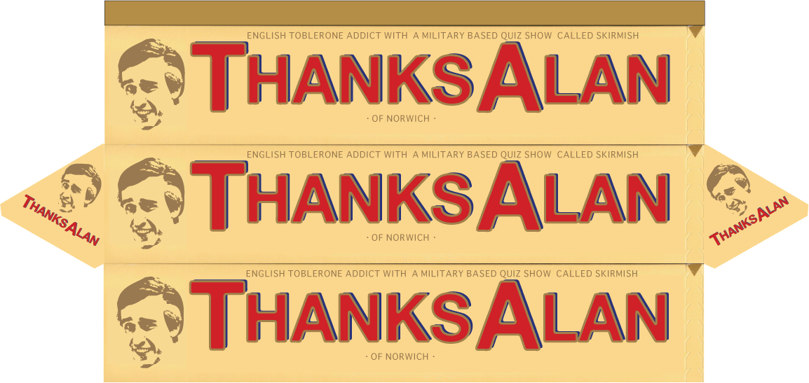
This is my final outcome for my "Thank You" project which I chose to thank my hero Alan Partridge. I designed a Toblerone box as Partridge developed an addiction to Toblerones. I think if I were to give this Partridge he would appreciate the light hearted joke. Obviously I couldn't hand it to him in person so I would just leave it behind the desk at Linton Travel Inn in Norwich!
1 Week 'til Hand-in!
This week I'm finishing the 4 parts of the project. I've devised a schedule which should see me finish all my final pieces for Wednesday evening, leaving me Thursday for any sketchbook work and print. Friday is the hand-in so fingers crossed I will have everything done. I'm feeling fairly confident as the last few days I've really worked well and ticked a lot of boxes on the schedule!
London Trip - Paula Scher Talk

London was a as hectic as ever and I can't see how anyone can live there! That aside I enjoyed it more than when I was last in London, the tube system I'm still trying to get the hang of but it was all an experience. I hadn't seen much of Paula's work before the talk and others had told me it wasn't all that good but I thought she had some good pieces of work. Admittedly her earlier work I didn't really appreciate. I really liked her hand rendered map designs. When she was taking us through her work I was getting flashes of inspiration for my own work so it was definitely of benefit.
Sound as a pound

I've chosen to design a piece that sums up the talk on the "4 Ways Sound Affect US". I had a few ideas which I kept pushing forward. The concept of my piece is to make the British public more aware of sounds around them by exposing them to 2 contrasting sets of sounds whilst attempting to complete an interactive puzzle. The first booth will play sounds of a loud open plan office. The second booth will play morning bird songs which would calm the person and increase their concentration level. There will be a short time limit on each booth.
The puzzle will be displayed on a futuristic screen which will be projected. The interaction is based around the film Minority Report where the user moves his/her hands much like you would use a mouse on a computer. Alongside their will be a panel within which your pulse rate is being monitored to provide a visual display of the partakers stress levels. This would identify the health risks caused from exposure to sound thus making the audience aware of sounds around them and how it affects them.
The puzzle is a sliding block puzzle, which is an image divided into blocks and jumbled within a grid, the user will then have to slide each block around to form the original complete image.
Wednesday, 4 November 2009
Communicating ideas
The final part to the 1st unit is "Communicating ideas" where we have to respond to an idea and communicate it visually. I've been given several video links to watch and then choose one to communicate to the British Public either through a paper based outcome or a Screen based animation lasting no longer than 30 seconds.
Now that I have watched the videos I've filed down my options to two ideas (I think...) which are:
I found that these two videos I can relate to and have some rough ideas floating around in my head that could potentially communicate these ideas. I'm undecided whether I will create an animation or something paper based. I'm leaning towards some sort of illustration as I've recently found that my knack for drawing has temporarily vapourised, maybe I'm not in the right frame of mind but I'm sure my drawing skills were much better 6 months ago!
I'm waiting for that "genius" moment to come strolling past.
Final Mushy Critique
I had a good response to my Mushy Pea design in my final critique. I pointed out that the nutritional ingredients and the product information needed work to fill up the space correctly and logically but that can be easily altered. The overall design was fairly successful and I'm really pleased that I really pushed forward my work from last week to produce a sound design. No more Mushy Peas! Well at least for a while anyway...
Wednesday, 28 October 2009
2nd Dreamweaver session
I found the 1st session really easy to get into and it's certainly benefited my concentration by having the session on a private study day. The 2nd session we went through some of the basics from last week and went from there. It was a bit more challenging this week with the html but I think I've coped reasonably well and my notes should help me when we go into the next session.
Mushy Pea Development
Since my crit on friday I went back to Waitrose to gain more research and understanding of other products, product placement and define my target audience. All of which have now become resolved, I hope. I've pushed forward a new design which I think ticks the right boxes for the criteria of the brief. I'm going to work a bit more on my logo and see what the tutors think in my tutorial tomorrow.
Friday, 23 October 2009
The Interim Critique
My interim critique wasn't the best as my idea looked too much like a copy of the Waitrose brand and I didn't have an image showing of where my product would be situated and no obvious target audience. I spent most of the morning really working on the type which shouldn't have been my main focus. In the critique I was hoping I had the opportunity to take everyone through my thoughts and ideas vocally but I felt shot down immediately which was justified but I'm now completely unsure of where to take my ideas and I don't feel I received much guidance on where to take my work.
Mushy Pea concept
Yesterday I found myself stuck with several ideas and just decided to go with one and develop it before it's too late. So I went for a design that I felt sticks to the brief the best suited the brief. I've gone for a design that is clean and should hopefully re-brand Mushy Peas successfully.

The product would be packaged in a sachet that would be refrigerated in the chiller next to the fish products in such supermarkets as Sainsbury's and Waitrose. The reason for its new placement is to reintroduce Mushy Peas unsavory reputation in the food market. Being a refrigerated product it probably won't last as long as something in a tin but the peas will be fresh and preserved in the packet. I was thinking the name "Original Mushy" could be a brand name that would have a range, like "Original Mushy Carrots".
Below is my initial idea of the look of the typography.
Thursday, 22 October 2009
More New from Old
Looking at the various Brands and designs of Mushy Peas out there it's clear to me that Mushy Peas haven't been shown in the best light. I think the designs currently out there could compliment the actual product so much better. The images that are used on the packaging aren't appealing to the consumer. I feel that Mushy Peas could be given a real fresh, natural and perhaps local approach. I mean in the sense of how Dorset Cereals is branded and has become very successful. Sainsbury's Mushy Peas didn't seem to have their own Higher market brand of Mushy Peas and perhaps that's what I should aim for. To create a much more refreshing, natural and rich look, perhaps design a limited edition with a golden colour palette.
New From Old
My latest project is based around re-branding a food product from a list. I have chosen to re-brand Mushy Peas. I've developed several ideas but I need to select one and push it forward. The idea that I feel has the most scope is to make a Mushy Pea flavoured crisp that would be accompanied by a mint sauce or some other kind of sauce. I envisage the crisp to maybe be part of Pringles and contain a small section that would be within the Pringle tube and could be detached from the main part of the product. I'm unsure whether a flavoured crisp is too far fetched and not sticking to the basis of the brief.
After the tutorial thoughts were raised as how to push the idea forward, it was suggested to design a Fish shaped fritter/ crisp that could be dipped into a potato sauce and a separate fish sauce. The idea being to flip around the traditional concept of Fish and Chips with Mushy peas and making the Mushy Peas the key part thus creating a playful and fun snack/ meal. I think the idea could work but I'm worried that it's too much of a novelty and it might be a product that wouldn't sell.
I prefer the idea of building upon what Walkers have done with some of their crisps with which they have combined random flavours together to form a new crisp, such as: Chili and Chocolate but push it even further and find something even more obscure that could combine with Mushy Peas.
I still feel that I'm behind with this work and need to settle on one of my ideas and just push it otherwise I risk my final outcome not reaching its full potential.
Tuesday, 20 October 2009
HVW8
This is a link to HVW8 which is a Production House and has some really wicked work that always gives me inspiration!
http://www.hvw8.com
http://www.hvw8.com
Business Identity
I was given a random name of a person for whom I had to create a set of Business Stationary. I landed Genghis Khan which I was thrilled about as I knew that researching this person would be really interesting and it had a lot of potential for a great set of Business stationary.
After extensive research into Genghis Khan it was apparent to me that I should either create stationary that would reflect his brutality and the presence the conquerer created or to design a set that would represent his efficience and overall power. I originally explored the 'brutality' option with a business card but soon found that my work was becoming cliched and obvious, so I moved onto a more contempory design that still had underlying messages of his notoriety, ambition and the typography subtly resembles the time of Khans existence. I have produced a Business Card, Compliment Slip and Letterhead whioch still needs more work to the layouts and typography which I will develop alongside my next brief.
After extensive research into Genghis Khan it was apparent to me that I should either create stationary that would reflect his brutality and the presence the conquerer created or to design a set that would represent his efficience and overall power. I originally explored the 'brutality' option with a business card but soon found that my work was becoming cliched and obvious, so I moved onto a more contempory design that still had underlying messages of his notoriety, ambition and the typography subtly resembles the time of Khans existence. I have produced a Business Card, Compliment Slip and Letterhead whioch still needs more work to the layouts and typography which I will develop alongside my next brief.
Monday, 12 October 2009
1st Project 'Thank You'
So now I will look at other ways I can show my appreciation to Partridge and push a concept that I might not necessarily be able to achieve due to resources and cost. I want to provide a really clever outcome that relates to Partridges' character and series.

This is one of the original concepts.
The Return to Uni
After months of inactivity I've returned to Visual communication for my second year. It's been a strange Summer which has flown by and now I'm looking forward to pushing myself and hopefully producing some wicked work. Over the Summer I was involved in the Larder exhibition at 60 Million Postcards which was running for roughly a week at the beginning of September. It was my first proper exhibition aside from shows at uni. I really enjoyed the whole process and was extremely pleased with the work I produced. It also allowed me to meet some other artists in the local area which was great. I will look to obtain the photos of the exhibition and post them shortly.

Below are the works I displayed in The Larder Exhibtion at 60 Million Postcards.


"Talking In My Ear"

"Drift"


"Life Restraint"
Subscribe to:
Posts (Atom)